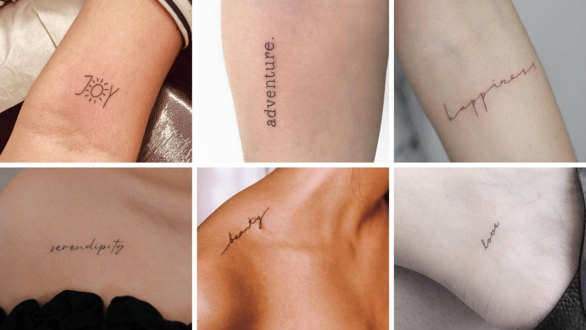
Ever stared at a blank patch of forearm and wondered what deserves to live there forever? These meaningful tattoos answer that with a single word.
Each one below is small, soft, and personal. You’ll see where it sits, how the lettering looks, and why it works.
Grab a coffee and scroll. One of these might follow you home.
Table of Contents
1. A Tiny Sun Turns JOY Into a Glowing Reminder
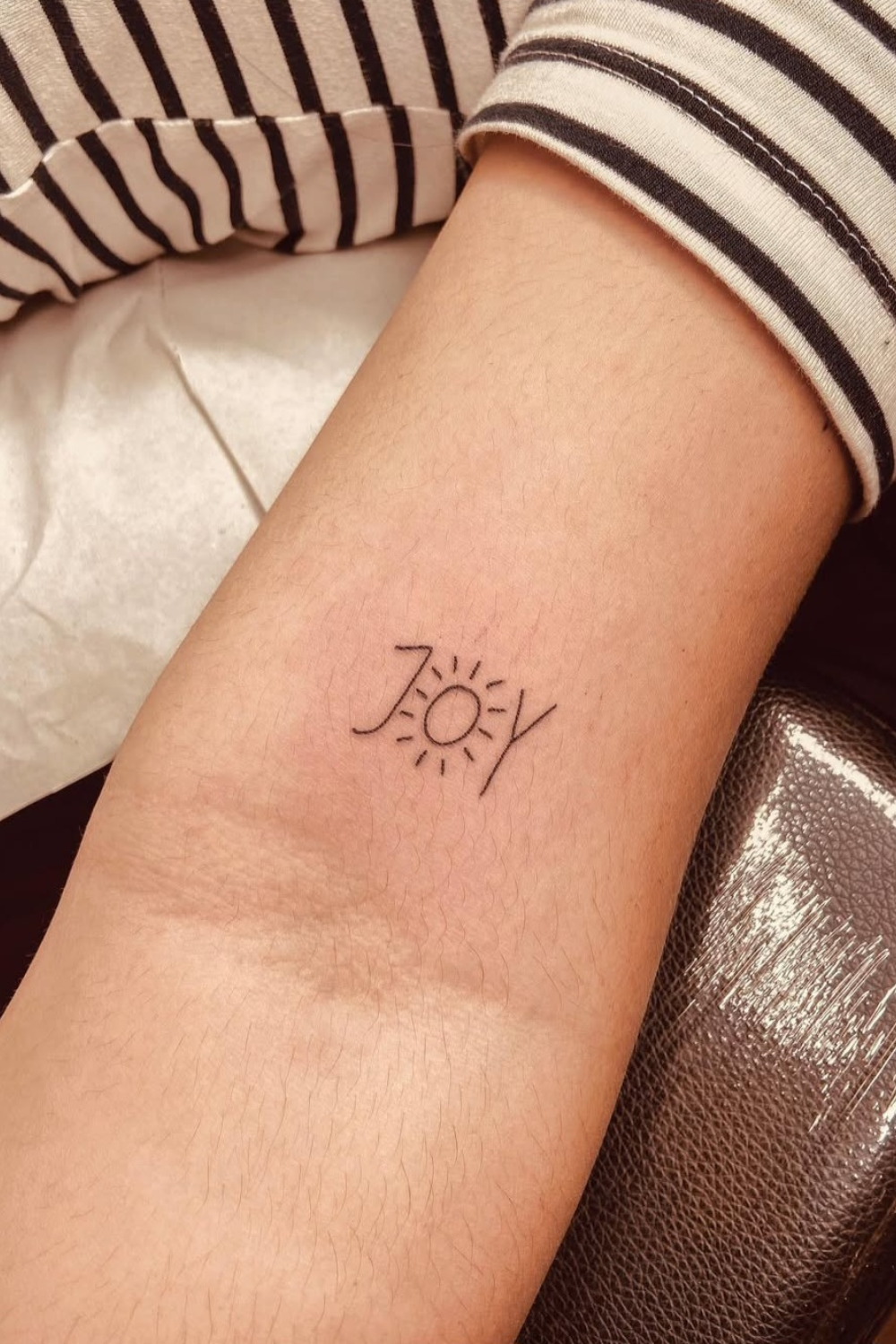
This one is clever. The letter O in “JOY” becomes a little sun with short rays, drawn in thin black ink on the inner forearm.
It’s small enough to hide under a sleeve and sweet enough to make you smile every time you check your watch.
Why It Works
- One illustrated letter adds personality
- Handwritten-style capitals stay light
- The inner forearm is easy to see and easy to cover
💡 Pro Tip: Keep the sun in the O about the same height as the other capitals, so the rays don’t crowd the J and Y.
Pick this if you want a mood-booster that never shouts.
2. Typewriter Lettering Gives Adventure a Vintage Voice
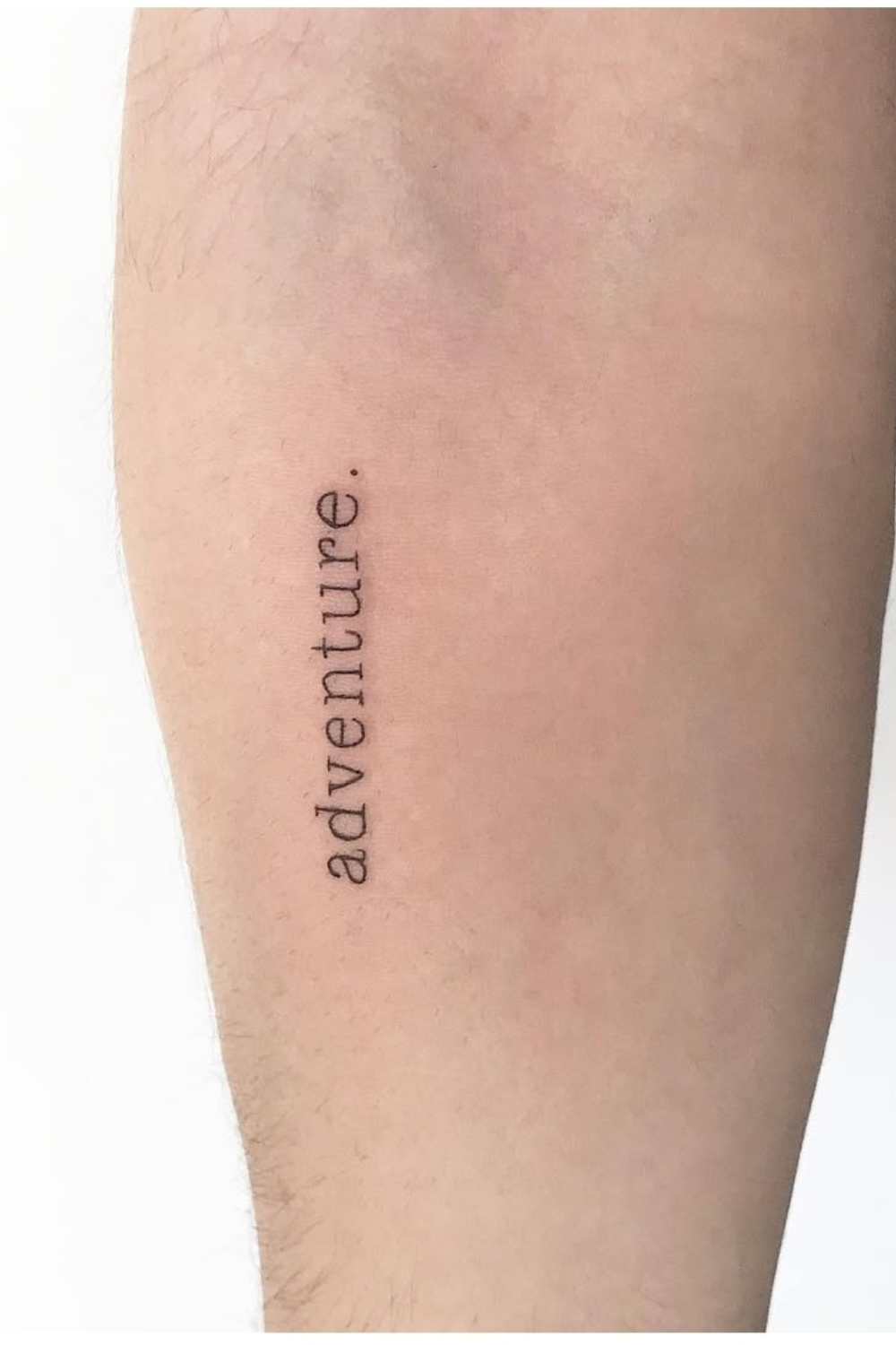
“adventure.” sits in lowercase typewriter serif running vertically down the forearm. That period at the end is a nice touch, like the word closed its own argument.
Crisp thin ink keeps it clean. I think this is one of the most underrated small meaningful tattoos with simple fonts, because the typeface does all the talking.
🤔 Did You Know? Typewriter serifs have slab-like feet, so tattoo artists usually keep letters at least a few millimeters apart to stop them blurring as ink settles.
Best For
- Travelers and notebook hoarders
- Anyone who likes a retro look
- People wanting a vertical placement that lengthens the arm
It’s a quiet nod to every trip you haven’t booked yet.
3. Hairline Cursive Lets Happiness Drift Across the Arm
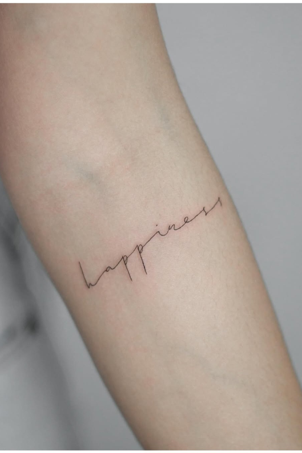
“happiness” runs diagonally across the upper forearm in ultra-thin, loose cursive. The tall loops on the h and p look like someone wrote it with a fountain pen mid-thought.
It’s airy and it moves. Not sure about a permanent commitment? Test the placement first with temporary script tattoo stickers and live with it for a week.

Things to Ask Your Artist
- Will a single hairline stroke hold up over time?
- Can the slant follow my arm’s natural line?
- How much space do the ascenders need?
💡 Pro Tip: Have the artist stencil the diagonal “happiness” and flex your arm before inking, so the loops on the h and p don’t bend oddly.
Soft, flowing, and a little bit dreamy.
4. Serendipity Settles Softly Along the Collarbone
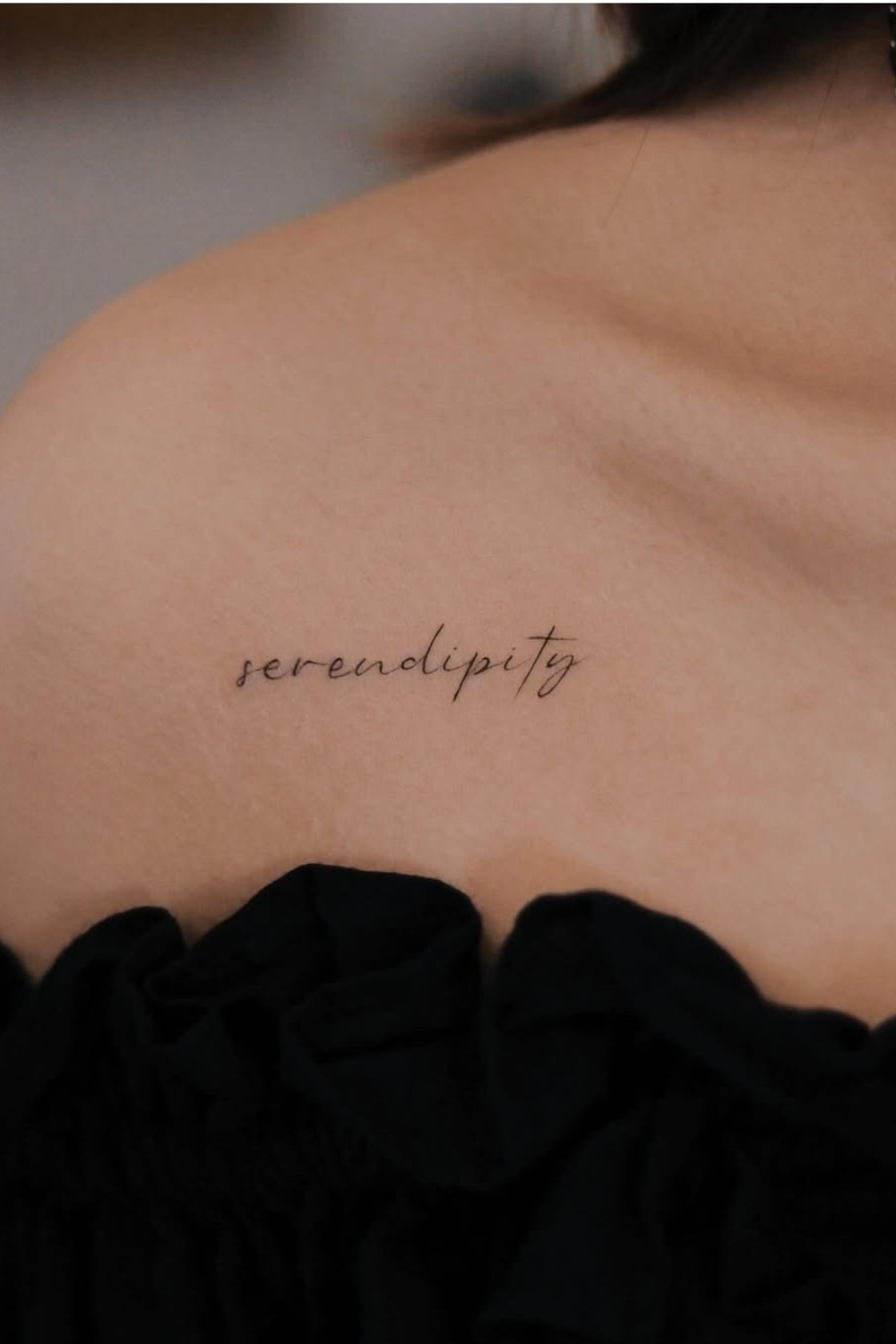
“serendipity” sits just under the collarbone in slim, slanted cursive. The strokes vary slightly in weight, which gives it a calligraphy feel.
A black ruffled off-the-shoulder top frames it perfectly. It’s one of those meaningful tattoos that looks like jewelry.
Placement Notes
- Follow the bone line so the word reads straight
- Leave room at both ends for movement
- Skip heavy shading to keep it delicate
⚠️ Avoid This: Don’t cram “serendipity” into a short stretch of collarbone. Eleven letters need breathing room or the slanted cursive turns into a smudge.
Great for necklines, straps, and happy accidents.
5. A Sweeping Tail Gives Beauty Its Graceful Curve
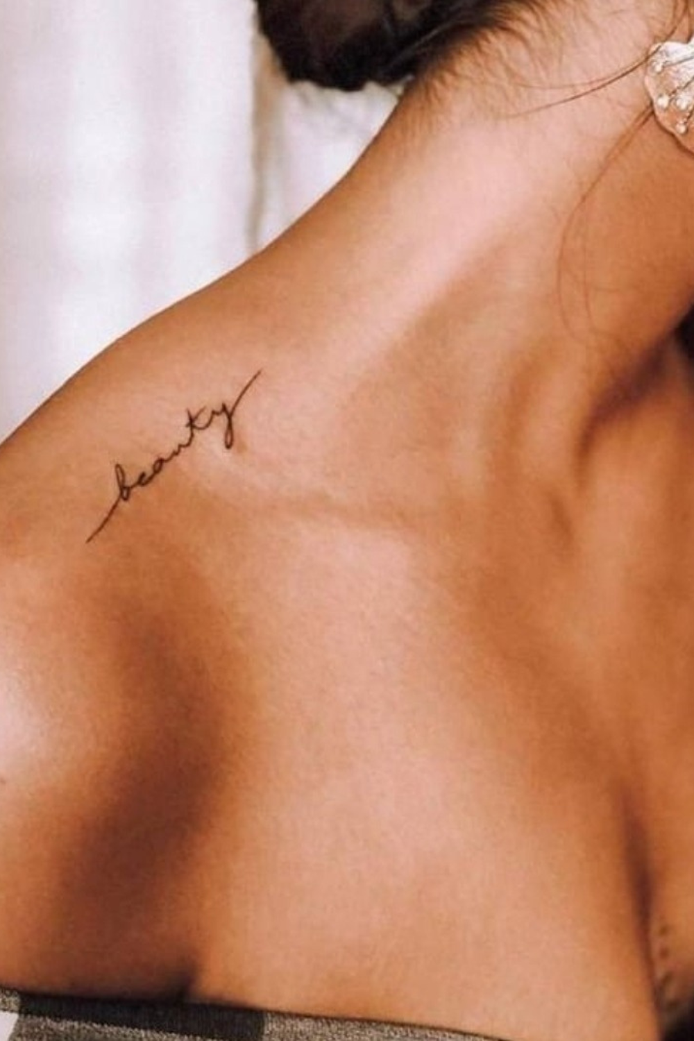
“beauty” curves along the upper shoulder near the collarbone. The final y stretches into a long tapering tail, and the first letter has a lead-in line.
On warm tan skin with a low bun and a pearl-and-shell earring, it looks like summer. It’s also a solid pick for meaningful tattoos for women with one word, since the flourish does the decorating.
What Makes It Pop
- The tail follows the shoulder’s curve
- Thin black ink stays elegant on tan skin
- A lead-in line adds motion
✅ Do This: Ask for the tail of the y to end before it hits the top of your shoulder, so seams on straps don’t rub it.
6. Love Stays Small and Secret on the Ankle
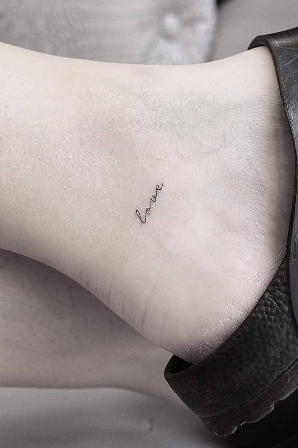
“love” is about an inch wide on the inner ankle, tilted slightly upward with the slope of the foot. A black leather sandal strap sits right beside it.
It’s tiny and private. Healing ankles can be fussy, so I grabbed a tattoo aftercare balm that’s fragrance-free for the first couple of weeks.
Healing Basics
- Skip tight shoes and straps while it heals
- Keep it clean and lightly moisturized
- Avoid soaking in pools or the ocean
⚠️ Avoid This: Don’t wear that sandal strap over the fresh “love” for the first week. Rubbing on thin lines can fade them early.
Small, soft, and yours alone.
7. Gratitude Flows Down the Inner Arm in One Line
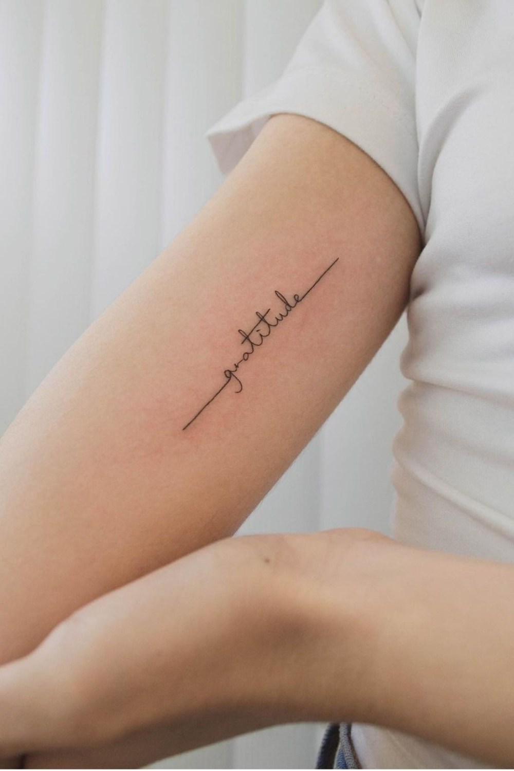
“gratitude” runs vertically on the inner upper arm in delicate cursive. One long thin line enters and exits the lettering, like a single breath.

Against a white tee and curtain, the tattoo is the whole show. If you’re wondering where to place meaningful tattoos for first timers, the inner upper arm is a friendly start because it hurts less and hides easily.
Quick Checklist
- Pick a spot that stays covered at work if needed
- Choose a continuous line for a cohesive look
- Keep it vertical to match the arm
💡 Pro Tip: Let the entry and exit line of “gratitude” extend an inch or so beyond the letters, so it reads as one flowing stroke.
8. Grateful Written Like a Quiet Note on the Hand
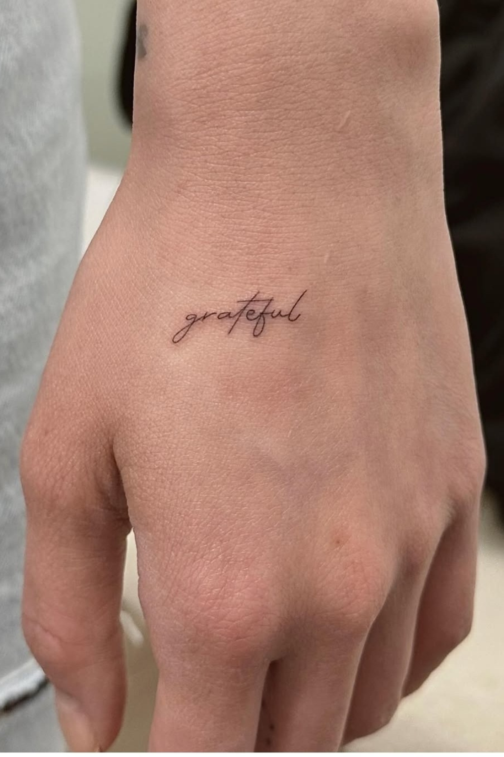
“grateful” is tiny and slanted on the back of the hand just above the knuckles. The crossed t-strokes look like real handwriting.
Hands are bold real estate, but this one stays gentle. Honestly, I love how casual it looks next to bare nails and a soft gray sleeve.
Know Before You Go
- Hand skin heals and fades faster
- Touch-ups are common
- Sun protection helps keep lines sharp
🤔 Did You Know? Skin on the back of the hand sheds and gets washed constantly, so hairline cursive like “grateful” usually needs a touch-up sooner than arm work.
A good fit if you want a reminder in plain sight.
9. Flourish Wraps the Wrist in Flowing Script
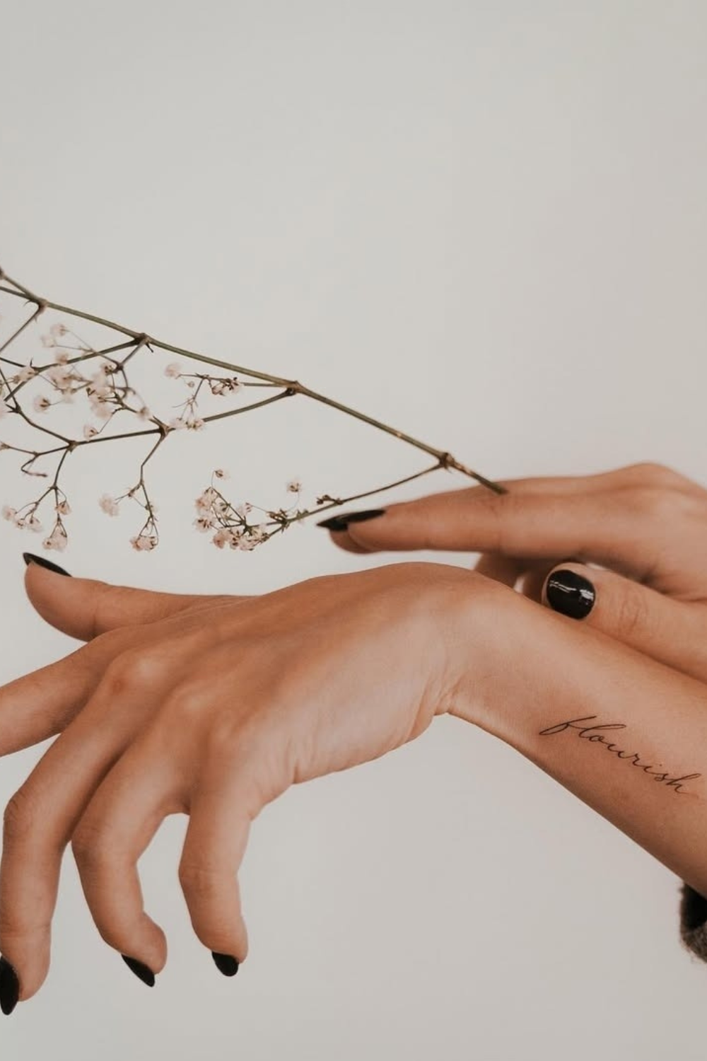
“flourish” runs along the inner wrist in thin dark cursive. The photo pairs it with a dried baby’s breath branch and glossy black almond nails against warm gray.
Want that moody contrast? Some black almond press-on nails get you there in ten minutes. And fine lines really are meaningful tattoos that look good as fine line script.
Styling Ideas
- Pair with neutral, earthy tones
- Try a dried floral prop for photos
- Keep jewelry minimal so the word stays visible
💡 Pro Tip: Hold a stem of baby’s breath near your wrist for photos. Its tiny blush-white blooms make the thin “flourish” lines look even finer.
10. Breathe Gets Room to Rest on a Botanical Wrist
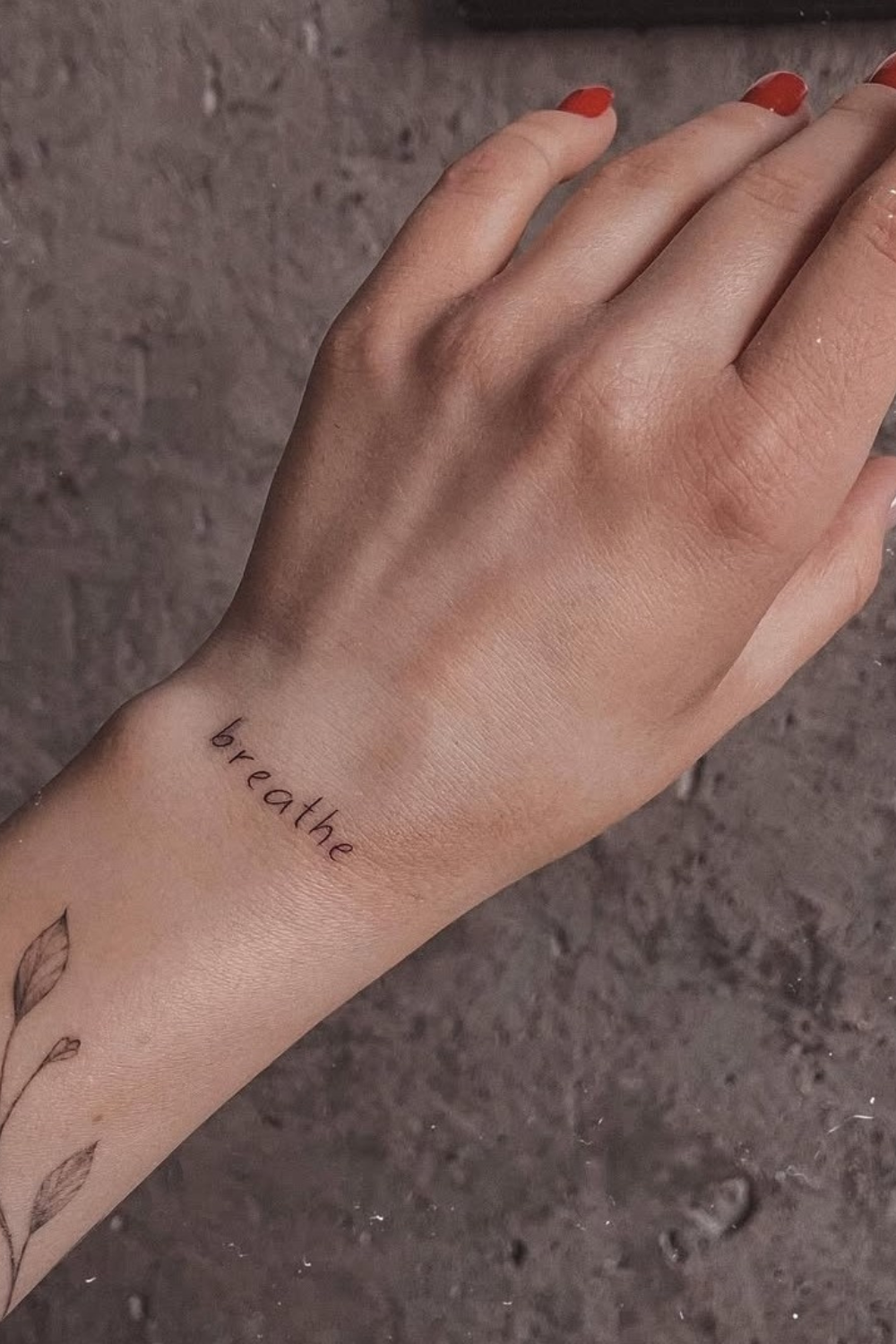
“breathe” sits across the top of the wrist in thin sans-serif script with wide letter spacing. Below it, a shaded leafy vine creeps onto the forearm.
Glossy red nails and rough gray concrete make the whole thing feel raw and earthy. If you already have a botanical piece, adding a word nearby is a smart way to build a collection of minimalist tattoos.
Layering Tips
- Keep the word lighter than the vine
- Leave a small gap between pieces
- Match line weight so they read as a set
✅ Do This: Space the letters of “breathe” evenly and leave a gap above the shaded vine leaves, so the word doesn’t fight the darker ink.
It’s a calm one, and your wrist will thank you.
Final Thoughts
Meaningful tattoos don’t need to be big to say a lot. One word, a good font, and the right spot can do it.
Start with a sticker, sketch your favorite word, and see which placement feels like you. Then book that consult with a smile.